Miriam Katin font
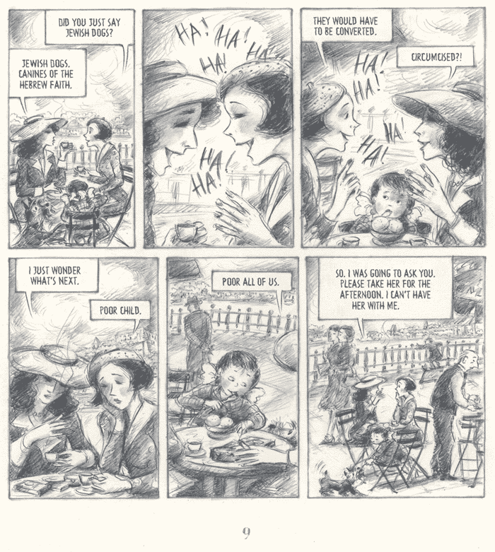
I will soon start lettering the Swedish edition of We Are On Our Own by Miriam Katin for the publisher Epix. It is the story of a little Jewish girl and her incredibly brave and smart mother, who go underground in Hungary during the Second World War, based on the author’s own childhood experiences.
I’ve made a custom digital font for the book. The original is lettered by hand with a graphite pencil. In order to make a digital font look like graphite, I made gigantic 2400 dpi scans of the text from the original pages, so I could create bitmap images of the individual letters with lots of fine detail. Then, when I lettered, I set the opacity at 50%.
The end result looks surprisingly much like graphite pencil lettering. :o/ Click the image below to see a sample (in English, because the Swedish translation wasn’t ready yet at that point).
© Miriam Katin
Blutch font
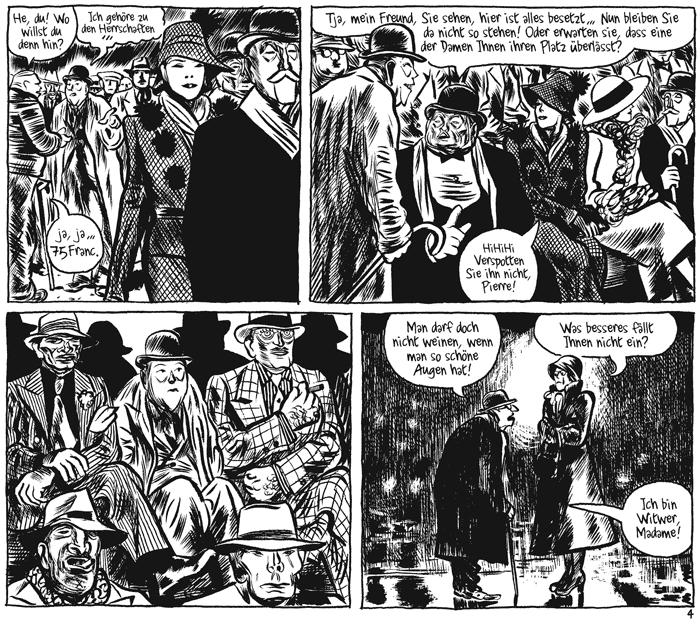
I lettered Blotch by Blutch for avant-verlag a while ago. The book, about a bunch of insanely petty and arrogant cartoonists at a fictional Parisian humour magazine in the 1930’s, is really funny and wonderfully drawn, and the German translation is very good, so it was a joy to work with this project.
I learned some new French phrases from this book. My favourite is “Tu vas voir mon cochon!”, “You will see my pig!”, which means something like “I’ll show you!”
Blutch has a very lively handwriting, so it took some effort to not entirely lose that in the digital font. Click the image below to see a sample of it:
© Blutch/Audie — Fluide Glacial and avant-verlag
MUSÉE TÉLÉGUIDÉE
It’s been out for a little while already, but the site is only now finally presentable, so I can link to it.

I made the graphic design of this book in collaboration with the author/publisher Quentin Duclos and associates. It’s a hilarious and insane work, hard to describe with words. If you can read French, check it out. If you’re in Berlin you can browse and buy it at Le Petit Mignon (Flughafenstr. 38, Neukölln).
I also designed the website of the publishing company.
