How I do watercolours
I used to paint a lot with watercolours as a child and teenager, but then I started to draw comics seriously, and at least in the 90’s and 00’s I had no affordable way of printing full colour comics, so I worked exclusively in black and white for ages.
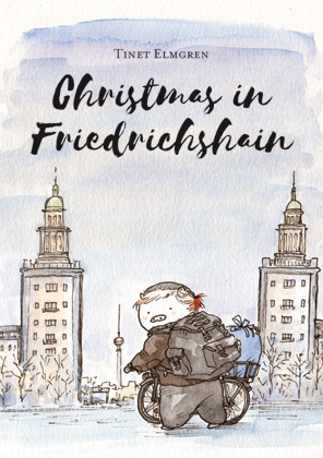
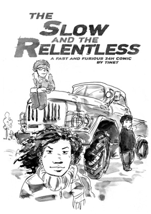
Only two years ago or so I started making forays into watercolour comics, with grey wash (The Slow and the Relentless), lots of little piggy sketches in colour, and my first colour comic (China White). Around that time, the Swedish comics publisher Ordbilder Media made a call for comic book pitches, including the option of an 80 page comic book in full colour. I pitched a watercolour piggy comic. The rest is history …
Here are my tools:
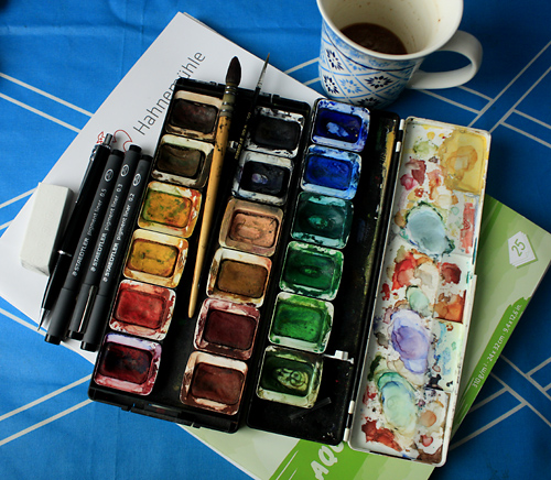
Cheap Hahnemühle watercolour board with a nice grain, Pelikan watercolours from 25 years ago, also 25 year old Raphael “Kazan squirrel hair” brush, size 1 or 2 (I’ve used it for watercolours and ink alike), tiny size “00” brush for the smallest details and cleaning up splotches. Staedtler pigment liners (sizes 0.2, 0.3, 0.5), mechanical pencil HB 0.7, lots of coffee … and finally, a Staedtler mars plastic eraser doing the devil’s work.
Half of the watercolour case and the browns and greens are from a Pelikan watercolour set (like this one) that my friend Nicole and I split in 6th grade, when our class cleaned out the crafts closet in our classroom. I supplemented it back then with blues, reds and yellows.
My process with this comic was as follows: I sketched with pencil on the board. Then I inked it with Staedtler pigment liners (they become waterproof after they’ve dried).
Then I committed the horrific act of erasing the pencil from underneath the ink. It does kind of ruin the surface to use eraser. But not enough for me to care, I guess.
Finally, I coloured with the watercolours.
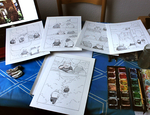
I often did certain parts of the colouring in batches of 4-6 pages, to save time and to make the colour consistent in the parts that should be consistently of the same colour in one scene, like their skins and hair and some of their clothes. This should not be overdone, though, since each page is an entity that must harmonize within itself.
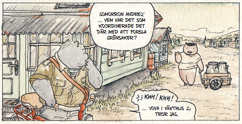
For the yellow morning light I started with a light yellow wash on the whole panel.
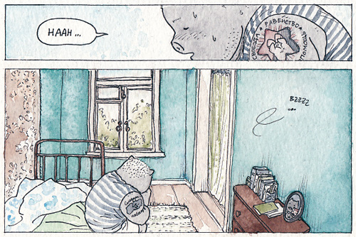
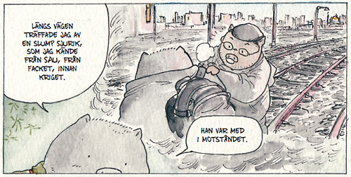
Before you’ve acquired truly mad skills, it’s usually best to use a somewhat limited colour palette for each scene, with two base colours and one or two accent colours. Above: brown/teal//light green/greyish blue.
Below (in the flashback): pink/grey//gold
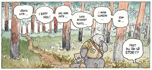
Green is a pain in the arse and difficult to make look bearable. This comic is set in the summer, in the countryside, so it has a lot of greens … For greens in nature I used blue-greens and yellow-brown-greens.
For the man-made swine-made structures, by contrast, I used more “straight-up” greens, to accentuate their artificiality.
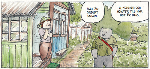
(Light green, turquoise and brown are popular colours for village houses in Tatarstan and Bashkortostan!)
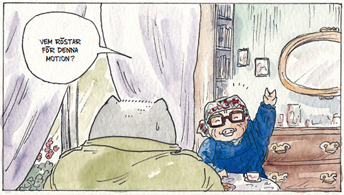
My favourite advice on watercolours from Hayao Miyazaki: Use transparent, not sticky, paint; paint another layer after the first has dried.
My favourite advice from Joann Sfar (in one of the Klezmer afterwords): Use “unnatural” colours.
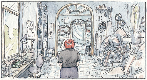
My own advice to myself: Don’t overwork the colouring with too much detail, and let the paper (or base wash) show here and there. With watercolours the most beautiful thing is the natural surface of simple strokes and washes. And keep some tissue/toilet paper handy. You will need it.
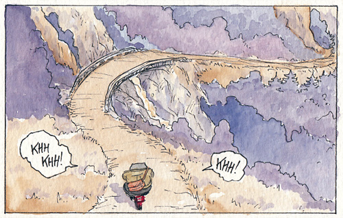
Finally, here is a video of me colouring one page in this book. It’s sped-up (obviously) – in reality it took me 35 minutes.
Akvarellfärgläggning: Tinet Elmgren / “Sockerärter” from Tinet Elmgren on Vimeo.
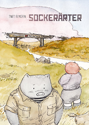
Sockerärter (“Sweet Peas”) will be released by Ordbilder Media at Stockholm International Comics festival, May 7th-8th 2016! I will be there to sign it and talk about it.
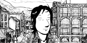


I’m very much looking forward to reading the this comic! Se you at SIS!
Fantastista!