Leading the reading
I have no formal education in arts or drawing comics, and a lot of my comics making happens unconsciously. Things I do are good if it just “feels right” or “makes sense” and bad if it “feels wrong”. Sometimes it can take a day or even a week until I find a solution to why something wasn’t working. At such times, I wish I knew more about the theory of making comics, so that I could know exactly why something isn’t working …
One thing I’ve started to pay attention to is how to lead the reader’s eyes across the page.
I started to notice how I do this during the editorial process of my Swedish Comic Sin anthology contribution. The books are made through collective self-publishing, and before the book is put together, everybody can critique each others’ comics and offer advice on what doesn’t work and how something could be better. Several of my fellow artists had problems with my frequent use of this type of layout:
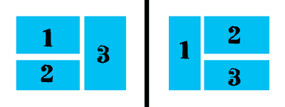
It’s very common in Japanese comics – that’s where I picked it up – and I like to use it because it allows for variety in the layouts. However, there are great risks of a culture clash when Europeans read this type of layout!
In Japanese comics, the reading order is strictly set as demonstrated above, and I can’t remember ever having seen the rules being broken. But in the rare cases when European comics use it, there are no fixed rules for the reading order, so artists often use arrows to point out the (to me often ‘illogical’) reading order. So when European readers are confronted with it and have no arrows to help them, they can get confused.
Now, I could scoff at them for being illogical and uneducated … Or I could compose my panels in such a way that there is no confusion regarding the reading order.
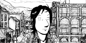
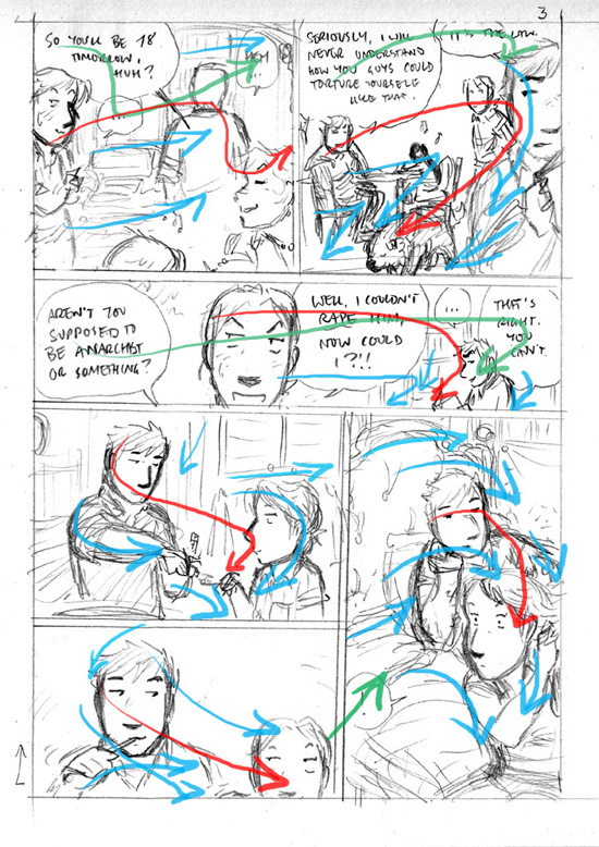
The page most people had a problem with was one where I’d sketched one crucial panel wrong, but didn’t bother fixing it before I sent out the sketches to the editorial collective:
Blue arrows: geometry (shapes, perspective etc.)
Red arrows: faces (and to some degree body language) of characters
Green arrows: speech bubbles and captions
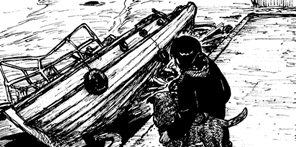
This is how I fixed it in the final version:
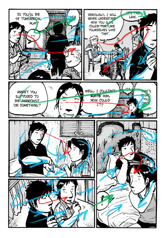
I composed panel 5 in a radical “<” shape, picking up the lines from panel 4 and redirecting them towards panel 6.
If I did it today I may even have changed the cabinet on the wall in panel 4, since it has unnecessarily confusing horizontal lines that point towards panel 6 …
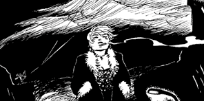
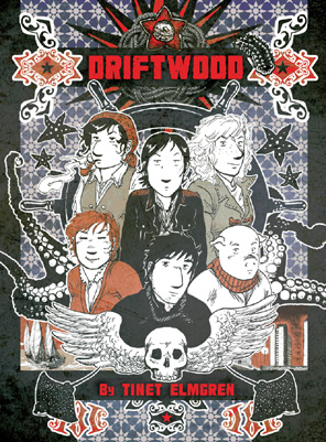
I’m not exactly a master of this trade, and I have a lot of room for improvement. But for everyone’s education I will post some more examples behind the cut, from my comic Driftwood!